

This game marked the first time, post-Hurricane Katrina, that the two local schools most affected by the storm would meet in the city of New Orleans (played in the Louisiana Superdome). Over $100,000 was raised to assist in gulf coast relief efforts.

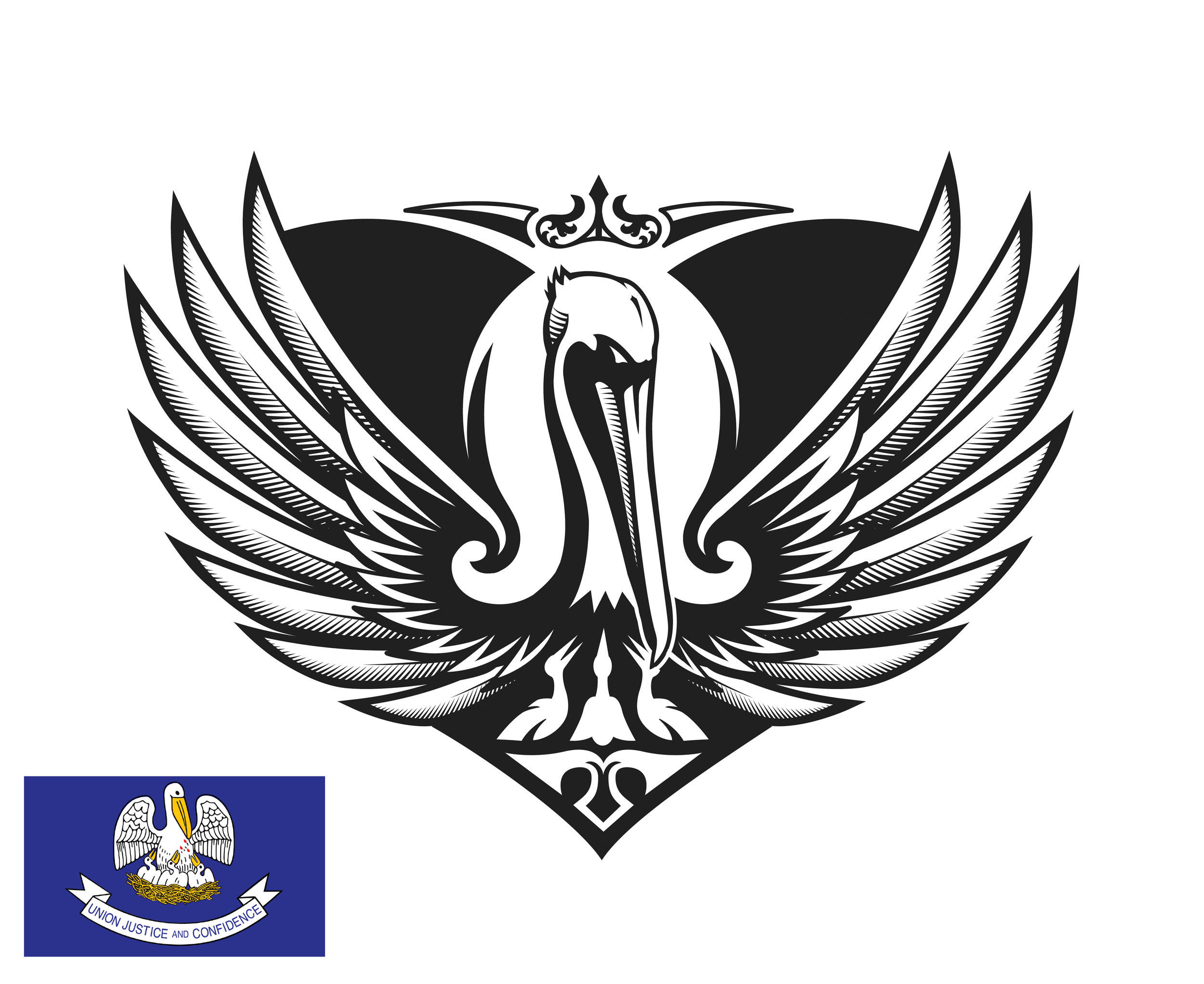
The logo was inspired by the state flag and state seal of Louisiana that depicts a mother pelican and her three babies. Early settlers noticed that, in a time of famine, a mother pelican would pluck at her chest with her beak to feed her babies with her blood. This example, while extreme, seemed to represent the strong-will and nurturing nature of the people living in the Katrina affected Gulf Coast.
This variation of the mother pelican is angry at how poorly her children (the residents of Louisiana) had been treated during the hurricane and in it's aftermath. Her wings were designed in the aesthetic of a Phoenix, rising up from the destruction and looking towards the future. The heart shape in the background stands for being wounded and persevering (as the LSU Tigers nickname and logo ties directly to that of an early military battalion). New Orleans style ironwork crowns the pelican.

Tonal ironwork shows up within the traditional "LSU" arched helmet word mark. There is also an additional combination graphic merging the two marks.

The pelican graphic was utilized on promotional materials, player-issued uniforms and sideline gear as well as retail apparel for both LSU and Tulane. For this head-to-toe look we were also able to obtain custom, team-issued cleats bearing the pelican logo.
(Photo Credit: Brett Davis USAToday)